

Displaying data in tabular format is almost inevitable in all data driven web applications. After the advent of responsive web design, there has been many proven concepts for making data tables responsive starting fromChris Coyier’s attempt to convert columns to rows labelled with column header. This article includes a collection of 5 best responsive table plugins or concepts each of which stands unique in the way it renders the table in devices with smaller screens.

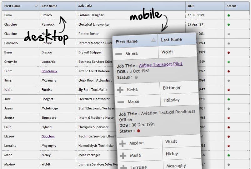
Footable.js
Footable is a jquery plugin to make responsive tables and my favorite too. It hides certain columns on smaller screens and the rows are expandable to show the data that was hidden. We have the flexibility to choose which columns to hide temporarily or permanently in case of smaller screens and the way the hidden columns are shown by expanding the rows is simply awesome. I have used this plugin on my demo’s & downloads table.
Responsive Table Design by Filament Group
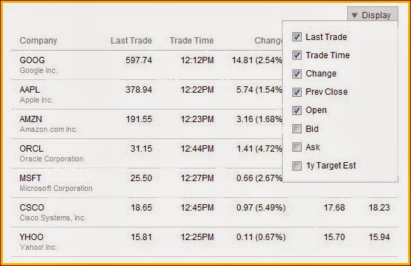
Another approach proposed by Maggie of Filament Group provides all columns to the user and lets the user select which column to display on smaller screens. You can find a detailed explanation here. This is now available as a jquery plugin called MediaTable and open sourced by Marco.
Flip Scroll
This is purely a CSS based approach published first by David Bushell. It simply converts the columns to rows keeping the column header as first element in the row. It does not hide any column instead enables horizontal scrolling to view more data. When you want to enable users to compare data in every row then this approach would be the right choice for it. Thanks to Simon Elvery for providing an example with code for David Bushell’s idea here.
Zurb’s Responsive Table
This is similar to David Bushell’s approach explained above in the fact that it introduces an horizontal scrollbar on smaller screens but it does not convert columns to rows. It simply keeps the first column sticky and enables scrolling on other columns. This is designed as part of ‘Foundation’, one of the most widely used responsive front end framework.
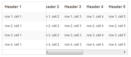
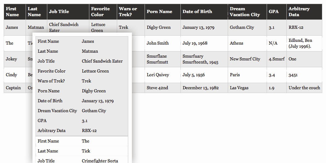
Chris Coyier’s Approach
Last but not the least, this purely CSS concept was the first proven approach for making a table responsive by Chris Coyier. According to his idea, each row is grouped into a list of key value pairs, thereby columns disappear. If you have very less number of columns in a table this approach can be of use to you, however comparison of data between rows becomes hardly possible when the data in a single row is stacked one after the other.
I have listed five best responsive table concepts and plugins above. But selecting the right one depends upon your original intention or requirement of presenting a table to the user. This article written on picking a responsive table ideal for your requirement would help you in choosing the right one.
Facebook Comments